Traders are surrounded by tools: oscillators, moving averages, volume profiles, and price action models. But with so much data at hand, the real challenge is clarity. Two of the most commonly used visual tools are the stock market map and traditional stock charts. They serve different functions, but both aim to answer the same question: where is the opportunity?
The choice between them isn’t about picking sides. It’s about understanding how each works, and when one might reveal something the other doesn’t.
What a Stock Market Map Does Best
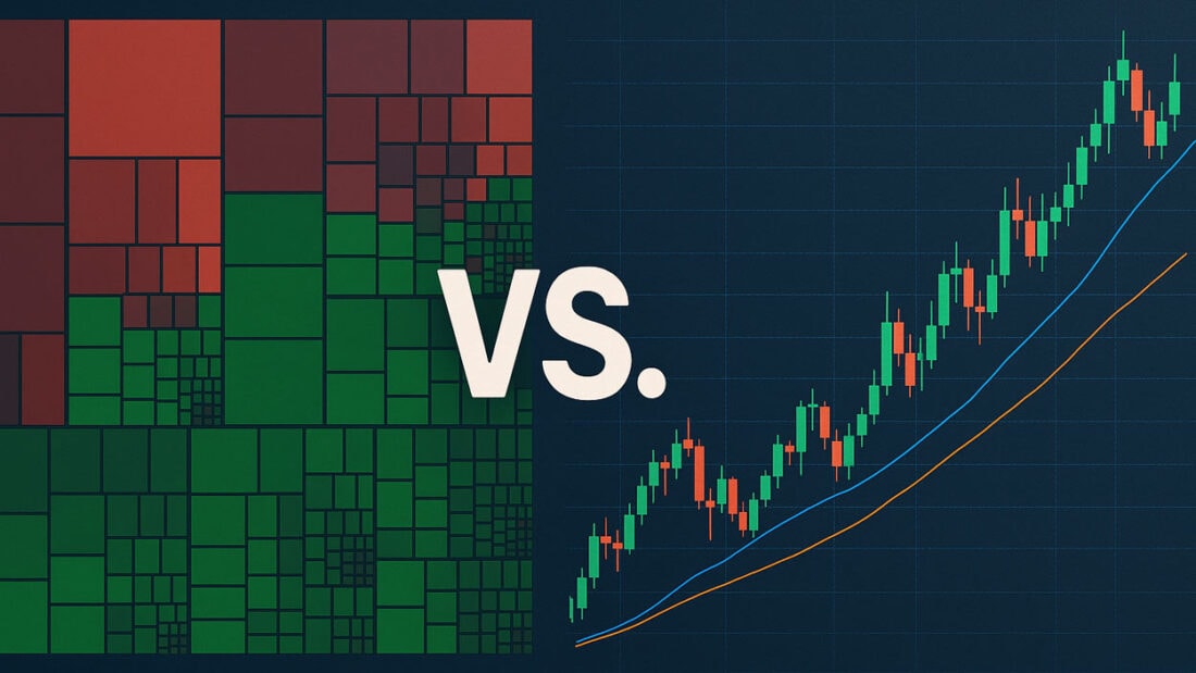
At its core, a stock market map presents an instant, color-coded overview of how various stocks, usually grouped by sector, perform over a given timeframe. Companies are represented as rectangles. Their size reflects market capitalization; their color indicates price movement. You’re not diving into one company’s performance. You’re zooming out to see the forest.
This bird’s-eye view is invaluable when assessing the market’s health or identifying where capital is concentrated. For example, if industrials, tech, and energy are all deep green, there’s widespread buying pressure. If only utilities and staples are green, the market may be risk-off. No single chart offers that kind of macro-level pulse.
What Traditional Stock Charts Reveal
Stock charts: candlesticks, bar charts, and line graphs give traders a time-based view of price action. They show support, resistance, trend direction, volume spikes, and volatility. For decision-making at the trade level, nothing replaces a clean chart.
A chart tells you how a stock behaves, reacts to news, and performs relative to past price zones. The chart is your reference point to time an entry or set a stop-loss. It’s surgical, detailed, and precise.
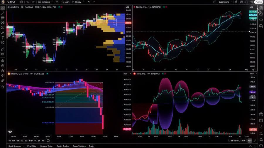
But precision has a downside, narrow focus. You can’t see how that stock fits into the bigger picture unless you manually check dozens of others. That’s where the map regains value.
Seeing the Market Through a Heatmap
The real advantage of a heatmap is how it transforms complexity into clarity. It doesn’t overwhelm you with technical detail. Instead, it asks a different question: where’s the money going?
Traders often use the heatmap at the start of the day to decide where to focus their attention. You see early sector rotation if multiple tech stocks surge while energy turns red. This kind of movement is hard to catch by looking at charts individually. A heatmap lets you see the whole field before choosing where to play.
Combining the Two Approaches
You don’t have to choose between maps and charts. Many experienced traders use them together. A stock heatmap helps you identify which sectors are active and which names within those sectors are leading. From there, you can pull up individual charts to evaluate trade setups.
Let’s say the map shows intense green across semiconductors. You notice one name is outperforming. You then move to its chart and see a clean breakout from consolidation. Now you’re trading with both context and precision.
Where the SP500 Heatmap Stands Out
The SP500 heatmap is one of the most widely used maps. That’s because it focuses on the U.S. market’s largest, most liquid companies, the names that drive index performance. Watching how they behave, not individually but in clusters, gives traders a read on market momentum, sector strength, and sentiment shifts.
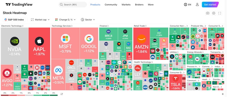
And because the SP500 reflects institutional flows, changes in its heatmap often precede broad market moves. When major sectors light up together, it’s usually not retail activity; it’s big money making big decisions.
It’s Not Either-Or
If charts are your microscope, then the map is your radar. One gives you focus. The other gives you range. A chart helps you plan the trade. The map enables you to choose the battlefield.
The stock market map and traditional charting tools give traders a deeper, more complete understanding of what’s moving, why it matters, and where to act next.

